
Crunchyroll Social Features
Problem Summary
Crunchyroll is one of the leading platforms for streaming anime content, as well as distributing and licensing anime. The previous legacy site was outdated and had minimal changes to visual design and user experience over the last 6+ years. We wanted to redesign the site to not only be more modern, but also address key issues in navigation and content discoverability.
Role
As a Lead Product Designer, I led a team of 2-4 designers to mentor and guide the design direction of the high fidelity execution.
As a Principal Product Designer, I oversee the growth of the social features across all platforms (LRX, Mobile, and Web).
Years: 2018-Present
Creating a Community
One of the key defining factors of Crunchyroll that sets it apart from other SVOD services is the sense of community it fosters within its own ecosystem. While the redesign doesn’t support a traditional forum like the legacy website, we kept key features in the design in order to maintain and upkeep trust among users.
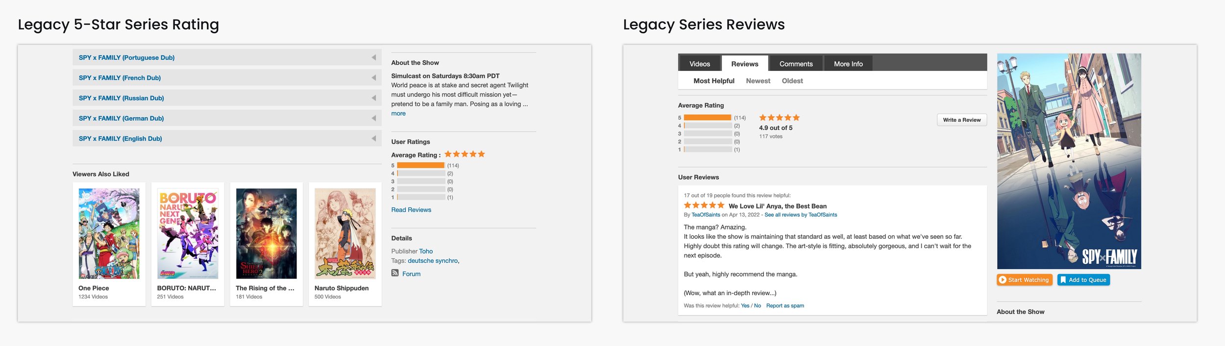


In order to maintain trust, drive user engagement with the platform, and help educate users on what shows to watch, we decided to maintain the ratings and reviews system that user testing showed so many users liked to read and write.
Ratings and Reviews
We kicked off this feature by reaching out to User Research and creating a survey to identify what rating system people prefer when rating and reviewing anime. Based on feedback, we concluded that a standard 5-star rating system worked best on a series level. We made this more nuanced by providing half point scales visually, and numerically to the tenth decimal place. These ratings were bolstered by numbers that showed how many users have rated it.
Along 5-star ratings, we also provide users with the ability to provide reviews. However, we found in research that many users don’t like providing reviews due to the effort required to create one. In order to reduce friction in getting users engaged with our social features, we allowed ratings to be input without a review, but reviews required a rating. By doing so, we give users the ability to easily rate series, and only leave reviews when they were interested.
Episode pages maintained a different style of ratings. We kept these different in order to make it clear what level of content you were rating. Through research we found that users rated and reviewed series to make decisions on watching that content, but users wanted to rate episodes based on who much they enjoyed it on a small-scale emotional response.
With that same line of thinking, we allowed users to leave comments based on reactions to characters, events, or anything else they were interested in. The effort was considered low in order to participate, so we wanted users to be able to engage with each other dynamically as events happened in the show.
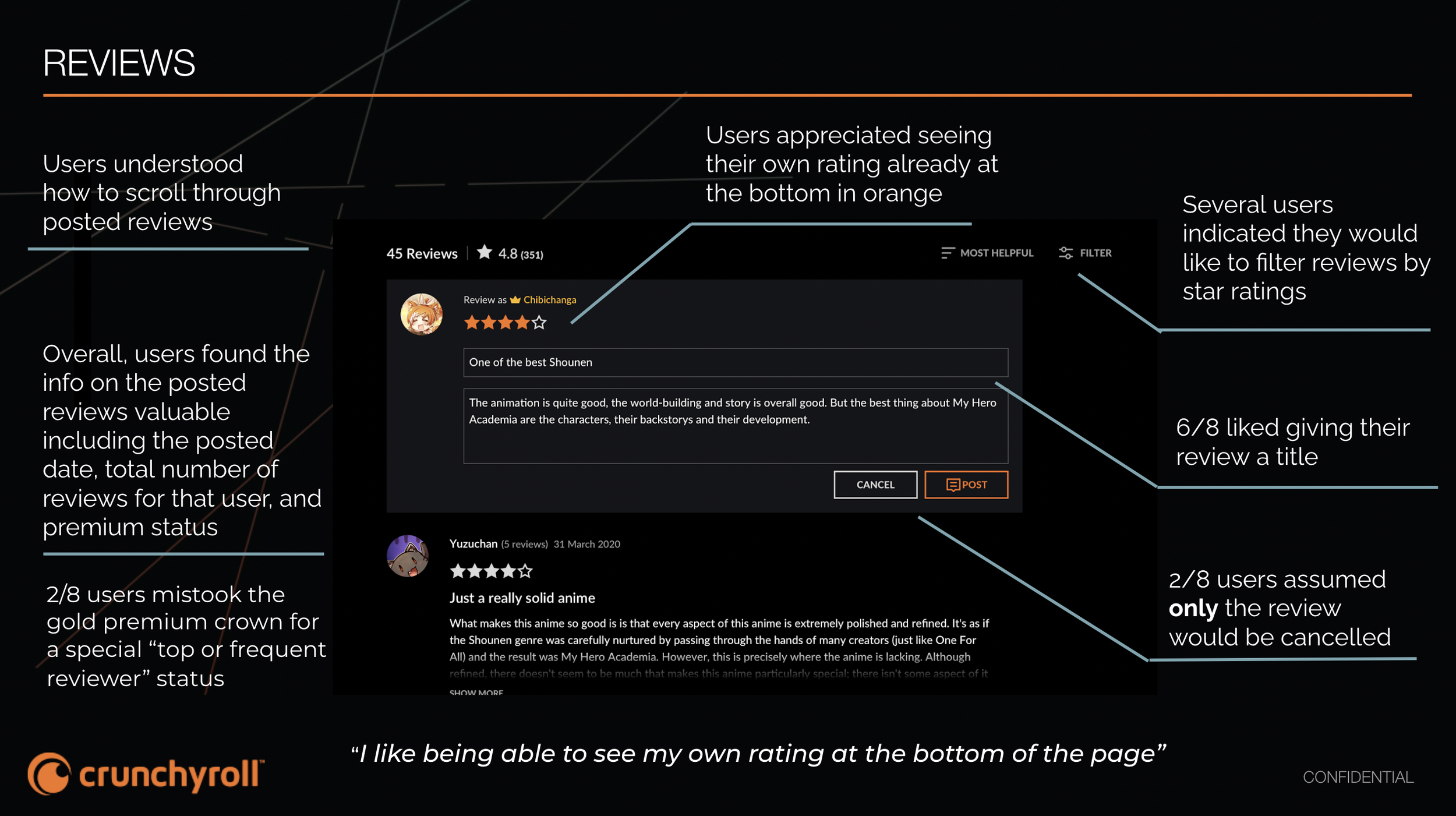
User Testing
Once we came with a system of how users could rate and review series, we began moderated user testing to see if users understood the changes we made to the original rating and review system and how people liked it compared to the previous legacy design. The overall reaction was positive, and people responded well to both the new website design (which hadn’t been publicly released yet) as well as the new rating and review mechanics.
Crunchylists
Through research and understanding of the anime community, we found that one of the main things that anime fans enjoyed was to create and curate their own lists of shows. While we have watchlists for users to watch, Crunchylists was designed to give users freedom to organize and add a variety of series to express whatever it is they wanted.

But how do we differentiate this between a watchlist? Are they not all lists? In order to help clarify the differences, we gave each treatment a strong visual contrast but listed both features under a new category called “My Lists”. We feature more episodic information for watchlist in order for users to understand it’s their current marker for what shows they’re watching. It’s also considered more easily accessible for more casual users as well.
For Crunchylists, we followed more of a traditional list design and format with a focus on Series metadata. We allow users to add items to a list from a series page or from the actual list itself, with a search function that can quickly and dynamically add series to the list.
We also expanded the engagement with Crunchylist to go beyond just the feature. Rather than keeping the feature isolated under My Lists, we included a call to action on each series page to allow users to add each individual series to a list of their choice. From an IA structure, users are able to include new series on a singular level, versus reviewing and adding in bulk from the individual list view.
The Future of Crunchylists
Due to technical limitations, a lot of what was currently implemented in the designs were driven by what was already established in the backend. Future improvements and action items that we as a team wanted to do include:
The ability to share lists publicly with other users.
Series description provided with each series for more information.
Lists showing previews of different shows within the list.
User test and review engagement of the Add to Crunchylist CTA versus Add to Watchlist CTA on the series page.