Crunchyroll Redesign
Problem Summary
Crunchyroll is one of the leading platforms for streaming anime content, as well as distributing and licensing anime.
The previous legacy site was outdated and had minimal changes to visual design and user experience over the last 6+ years. We wanted to redesign the site to not only be more modern, but also address key issues in navigation and content discoverability. The entire redesign also had to be responsive.
Role
As a Senior Product Designer, I initiated the project from the beginning, running user tests, creating wireframes, executing high fidelity designs, as well as define major components in the early stages of the design system.
As a Lead Product Designer, I led a team of 2-4 designers to mentor and guide the design direction of the high fidelity execution.
Years: 2018-2021
Research and Identifying Key Problems
Due to the need to complete an MVP quickly and technical limitations of a pre-existing code structure, I decided that my first order of business was to gather data about what worked well for the legacy site and what didn’t work well. I reached out to User Research to begin working on a guide for a moderated test while I work on self assessing the information architecture of the current legacy website in parallel. The goal was to have a relatively complete prototype in time for the moderated test, so it was important to work quickly.


After a few rounds of user testing, we found a couple key issues we wanted to address.
Discovery was poor, with the browsing experience offer little for users to find content.
Series page did an adequate job of helping educate users on whether they should watch it or not, but could be improved.
A large percentage of users used the Watch History as a way to resume episodes and shows they were watching.
Homepage prioritized power users who were there for content outside of the video experience.
This case study will to focus on the first two key areas of improvements for the initial MVP pass: the browsing experience and the series page. The entirety of the redesign however, also covered spaces such as the watch page, an initial pass at the homepage (which addresses the pain points #3 and #4), and genre pages.
Finding Solutions
We had personas that were previously developed by Crunchyroll’s UXR team that covered all of the product and branding needs. We cross referenced the legacy site’s paint points with how it affected each persona’s day in a life flow of using the app, and we broke down what specific problems we needed design solutions for.


From the data that currently existed, we found that users who added more content to their watchlist were more likely to spend more minutes watching, which increases numbers of ads watched, the potential conversion of new users to premium, and keeps premium users on their premium subscriptions. With the browsing experience being a key issue for new and existing users, I decided to work on this problem first in order to increase discoverability, which will then lead to increased watchlist adds and minutes watched.
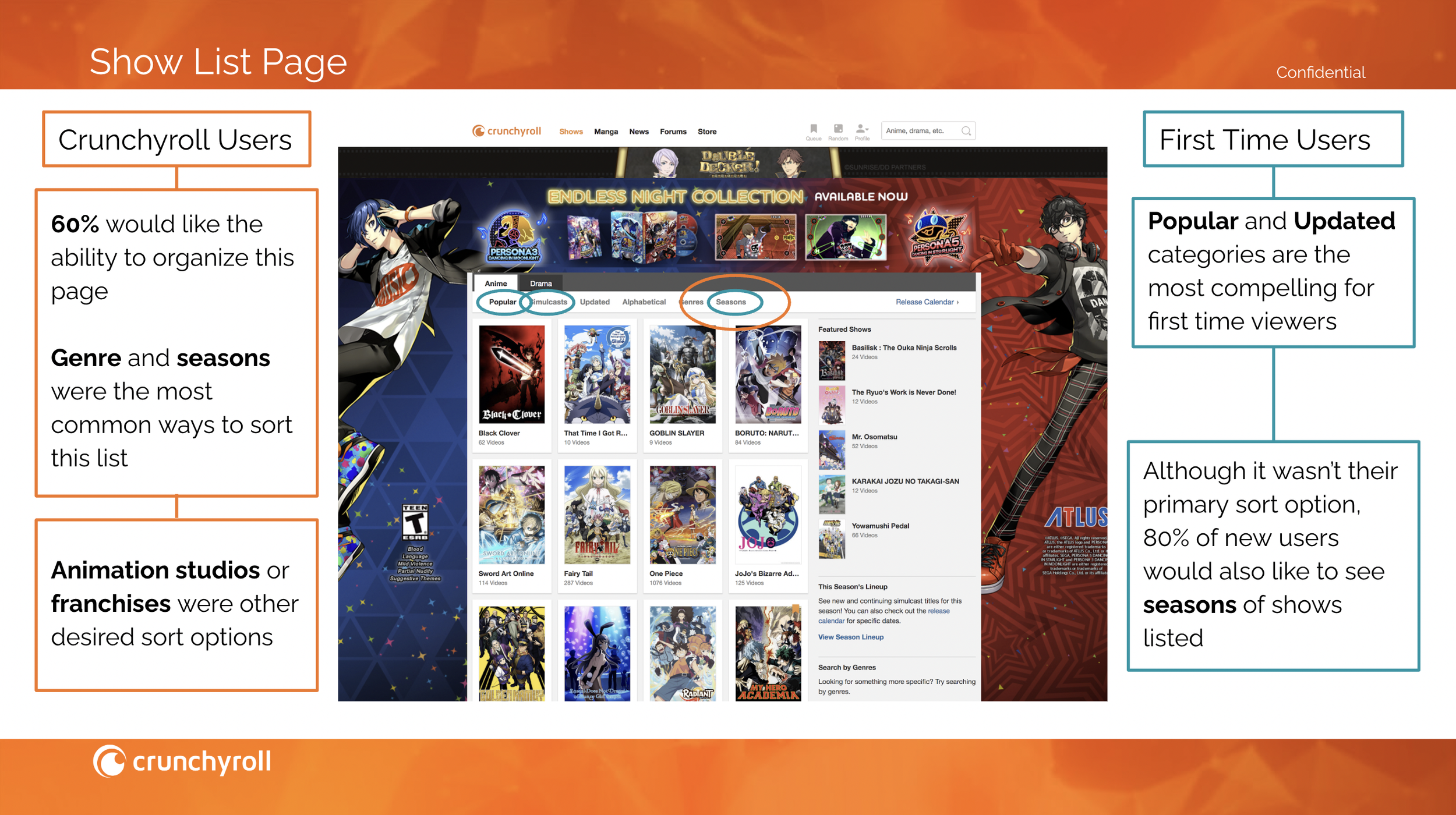
We had a hypothesis from our previous watch history data and user tests that users often wanted to watch specific genres based on the time of day or moods. Using this hypothesis as a base for my explorations, I wanted to surface the diversity of our anime content much earlier for users to discover in the navigation. Rather than burying genres and categories of content in one page, I brought it all a level higher in the site’s IA and laid it out as a submenu that will open on hover.
The browsing page was also simplified to have a stronger focus on series artwork and customization. By using the sorting and filtering tools, users were able to narrow down the content based on whether it was a movie or series, or if they felt like watching subbed or dubbed content.

Based on previous comments in user testing, I also introduced different custom designs for the different browse pages depending on whether users were interested in browsing by simulcast seasons, alphabetical, or newest. By focusing on the goals of what users are trying to accomplish with each browsing category, we hoped new users would be less overwhelmed by the large content catalog and power users would be able to find exactly what they wanted more quickly.
When we switched our focus to the series page, there were a few key things that I kept in mind.
Users should be able to start watching a show quickly.
Users should be able to pick up where they left off quickly.
Users should be able to learn more about a show easily and quickly.
Users do not necessarily need to see the entire list of episodes.
Because the previous design used a sidebar design, which limited information shown and visibility of relevant CTAs, I went for a more traditional vertical design. Users are able to see the general information more quickly, with major call to actions brought higher up and made larger. They’re also able to quickly jump into a show with a thumbnail that serves as a shortcut to continue or start watching a show.
Many of the existing legacy systems on the series page were also kept, but were simplified. You can read more about the work that went into our social features here.
Establishing Visual Identity
With the help of our Principal Product Designer, we established the beginnings of the Crunchyroll Web Design System as well as the visual identity of our product. A lot of the new colors for the Crunchyroll rebranding included orange, reds, and golds with blue accents. While the color scheme is lively and bright, we found that it was overall too bright to use on an SVOD service. To offset that, we made the neutral colors predominantly dark grey and relied on orange and blue to provide accent colors for links and CTAs.
The majority of the system was a “reskin” of an older platform in order to move quickly to MVP, but we made sure to pick fonts and make adjustments to key components in order to give the design more of a Crunchyroll-oriented identity.
High Fidelity Designs and Beta Launch
With the Design System in place, we began to turn all of the wireframes into high fidelity designs. Some user feedback gave us ideas on areas for improvement for the next phase of the redesign, such as major homepage improvements. The progress of the work for homepage can be found here.
Once we got all of the high fidelity pages together, we created a new prototype and tested that design with users. The new dark color theme and improved navigation received high praise from users, with the general comments centered around how much easier it is to find content and how much easier it is on the eyes.
There were a couple KPI’s that we focused on when evaluating the success of the MVP:
Were users able to find series easily?
Were users able to easily add shows to their watchlist and access their watchlist?
Did the homepage easily provide content for users to browse and discover more series?
While we did eventually want to focus on increased premium subscriptions and account creations, the initial MVP launch was focused on currently existing Premium subscribers so we approached those explorations and tests in alter phases.
The work continued over a period of 2 years and was finally released in slow phases throughout 2021.
Conclusion
With a major overhaul for the first time in many years, being able to lead this project was a great learning experience. It taught me a lot about improving my communication, collaboration, and leadership skills as we slowly expanded the team to include more designers that I helped mentor and lead. While the redesign is not necessarily “done”, and is an ongoing effort until the Legacy site is sunset, this whole endeavor was a major push to getting an MVP out to users for feedback and iterative improvements.
A few key things were ultimately changed from my original vision that I hope will later be tackled in the future:
“Shows” in the header navigation was originally meant to open on hover, but due to technical limitations had to be opened on click.
Series page was meant to have large custom artwork for major tentpole shows, rather than just the staple series art.
Series metadata was meant to include additional interactive elements such as listing production studio (and browsing by studio), voice actors, seasons they aired, and available languages.
Previous Episode and Next Episode were meant to be on the watch page so that users could easily orient themselves in the series, but due to technical limitations it was reduced to just the Next Episode.