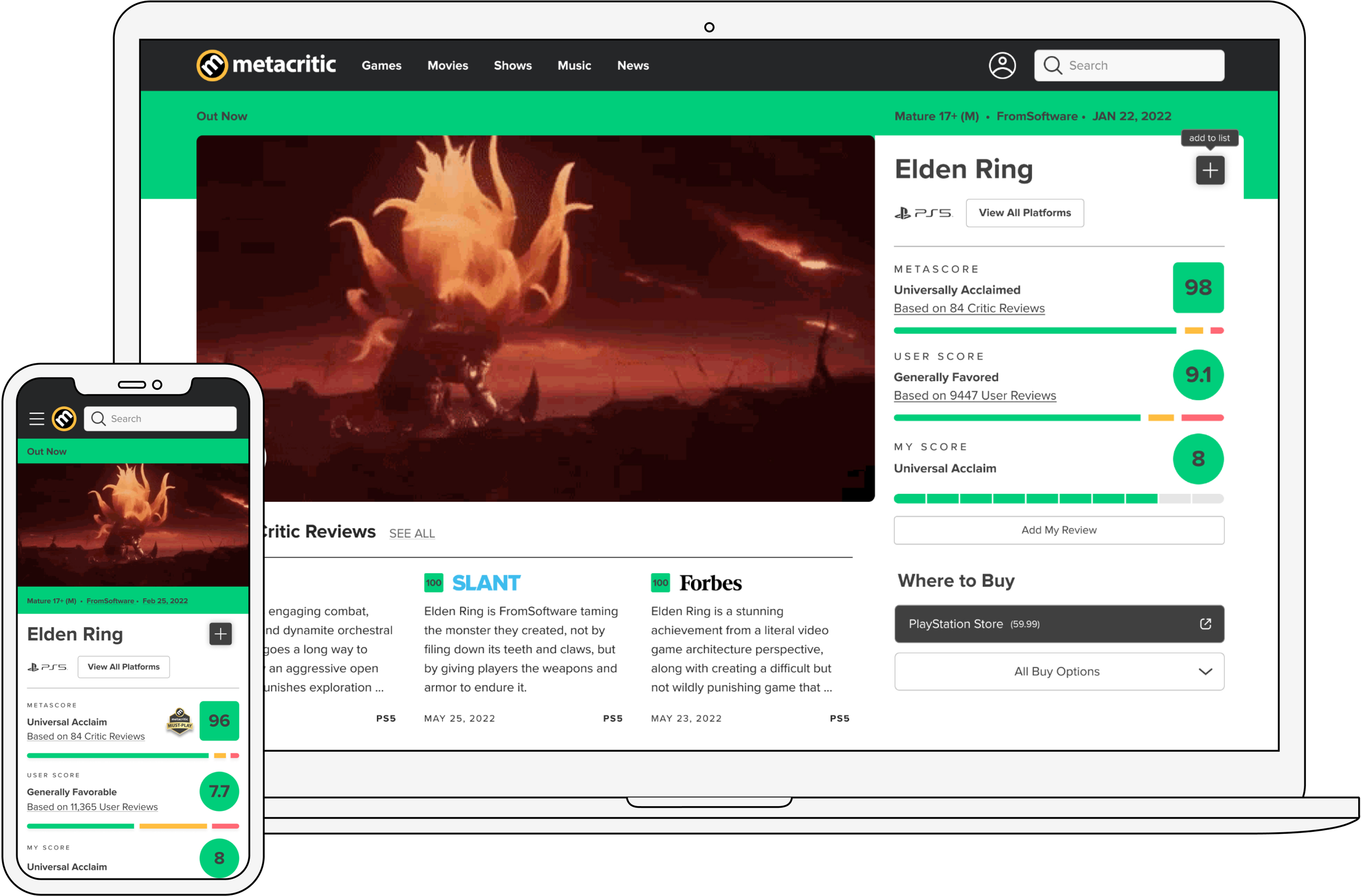
Metacritic Ratings
Role
Lead Product Designer, User Researcher
Duration
4 Months
Deliverables
Wireframes, interactive prototypes, high fidelity mocks, design system
Problem Summary
Metacritic hadn’t been updated in years and wasn’t mobile-friendly. There was a focus on updating all of Metacritic, front and back, to align with modern technology and make it more user friendly for new users.
Results
The updates to ratings drove a 210% increase in rating and reviews engagement, which also increased user account signups
Goals
Increase user signup and time on site - The data achieved from quantitative metrics and qualitative research showed that many users would land on the website, browse the ratings, and leave. Since we relied on ad revenue, we needed to increase user time on site as well as retention.
Increase user generated content - We wanted to increase user generated content outside of video games (which was our most active vertical on Metacritic).
Initial Userflows
A key assumption that was the basis of my design was that if we allow logged in users to rate something without taking them to any other page or modal and requiring a review, that it would dramatically increase engagement.
Usertesting
Our next goal was to usertest the visuals as well as the mobile interactions since that was significantly new for Metacritic. While we didn’t have resources for a moderated user test, I was able to create a prototype and post videos and images to UserTesting, and helped draft and write the questions.
Results:
There was higher desire to rate products and found the interactions and visuals to be appealing. They noticed it more easily than the previous legacy design.
Readable labels for ratings were universally seen as positive and everyone thought it helped them determine what their rating should be. Labels were easy to skim and quickly figure out what the rating was.
Users were much more likely to engage with the platform and sign up for an account if they could rate without reviewing. Only a small percentage of users considered themselves the type to leave reviews, and were more likely to do it on desktop than mobile but were open to doing it on mobile.
Majority of testers said they were likely to rate on mobile based on the prototype.
Deliverables
After the initial wireframes and prototypes, I prepared all the files for Engineering handoff by creating annotated edge states and rating states documentation, the final high fidelity mockups for MVP, and design system updates as needed for this new feature. I also worked with engineering to communicate the thought process and specific design details of this feature so that coding this would be as smooth as possible.
Conclusion
I left Fandom shortly before the launch of the Metacritic MVP, which was slated to happen towards the end of 2023. I spent the last months of my work with Metacritic ensuring that everything for ratings was updated, as well as improving UX of previously designed pages and creating the redesigns for pages in user profile and the news site.
When the MVP was launched, many of my designs were unchanged from when I had left. The updates to ratings drove a 210% increase in rating and reviews engagement, which also increased user account signups. The redesign and rating system were considered successful enough to move engineering and design effort to the music vertical to increase metrics in those products, which was previously left untouched due to scope and lower traffic.